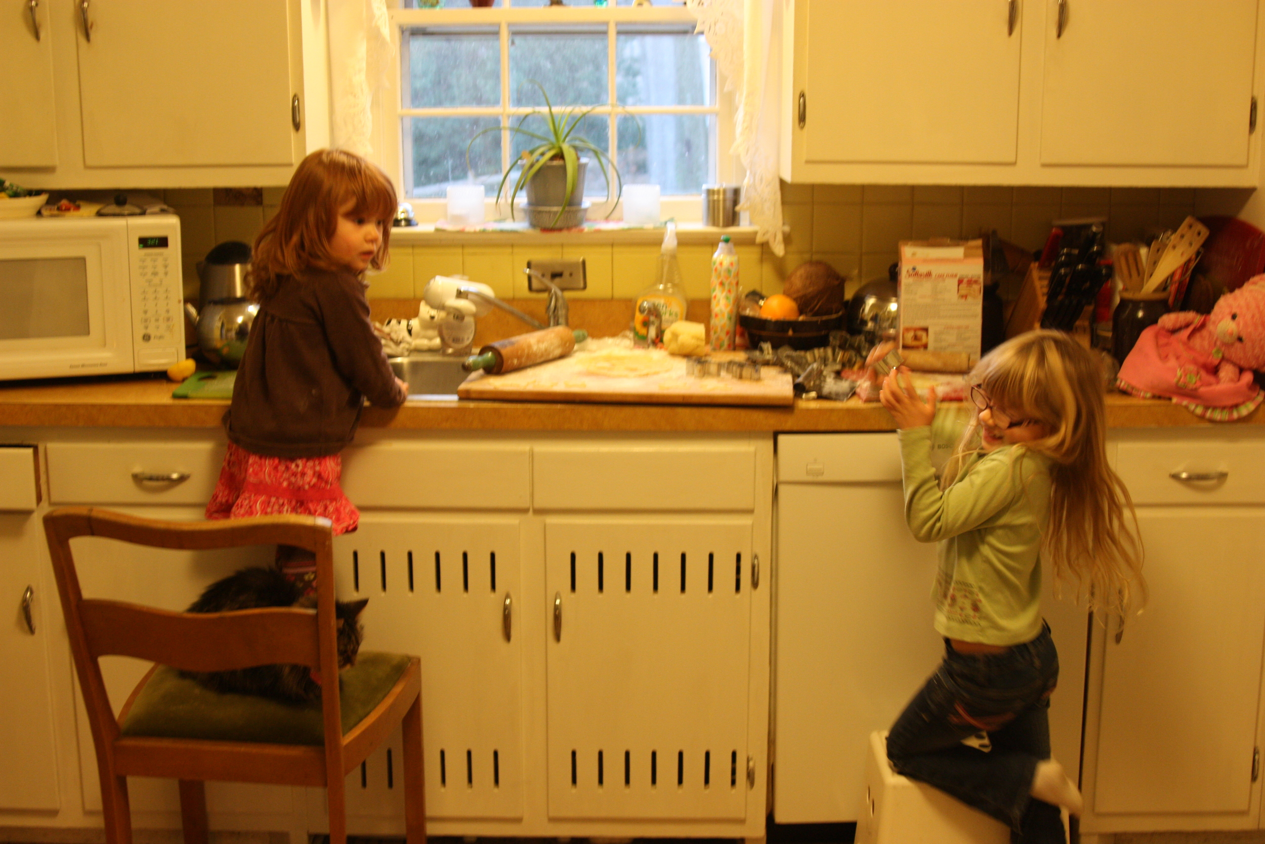
Ten years. It took me ten years to convince my partner that our boxy, counterspaceless, maize-plastic-tile-coated kitchen from hell (above) was not a good thing. It was hard to cook in, unlovely, and continued to look unclean after hours of scrubbing. Throw in spots of melted floor linoleum and shriveled wall tiles from a hot pan mishap, and the miserable kitchen picture was complete. But somehow he stood unconvinced and maintained an attachment to its amalgam of 1930s charm and 1960s and 1970s fugly remuddling. And my subtle and not-so-subtle complaints didn't make a dent. I needed a new approach.
I began perusing home listings and suggested we simply buy a new home with a new kitchen. This tactic proved wonderfully effective. After a month or so of "new house searches" I was told I could have my kitchen, but it was my project. I didn't realize what I was taking on.
Even if you find a great designer/contractor, which we did (plug for Oz Seaton at Oz Creations), it is a lot of work. And the pickier you are, the harder it is.
In addition to being unskilled in kitchen design, I am picky. A bad combination. Decision making took months, while the project took under a month to complete--fast for kitchen remodeling standards. Still, the process was an education. If I could do it again, I'd approach it with a lot more savvy.
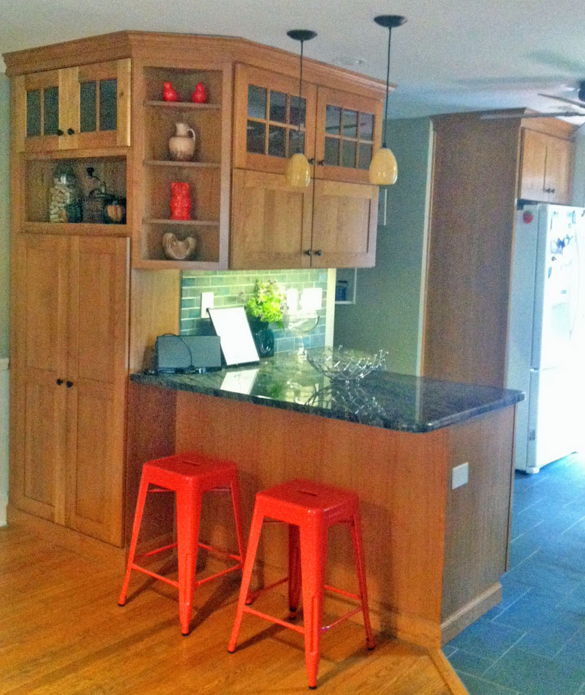
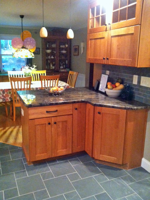
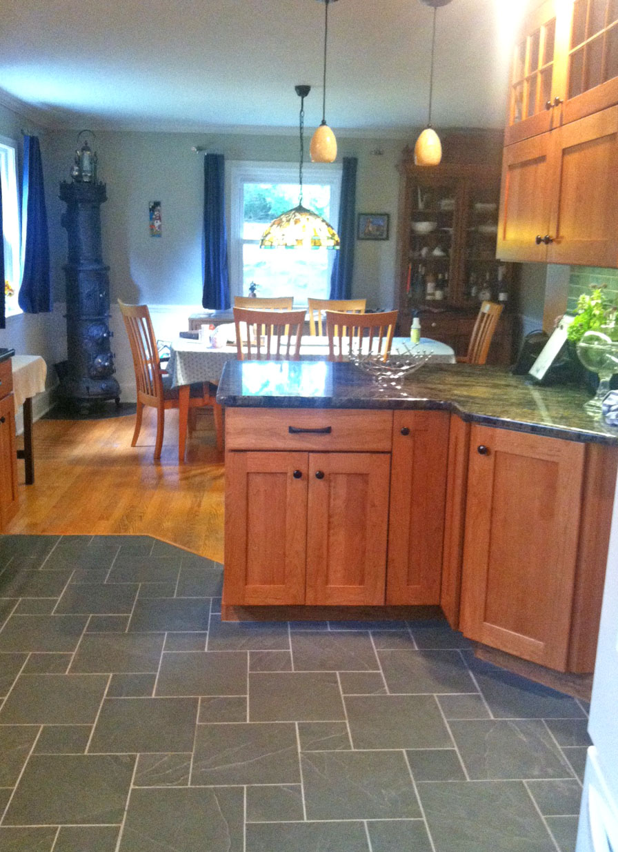
The design process took several sessions with our designer/contractor. Our small kitchen was enclosed by a non-load-bearing wall that divided the kitchen and dining room. He suggested we remove the wall, and in its place he designed a spacious island. (OMG, I actually have enough counter space to roll cookie and pie dough now!) An additional set of cabinets were added that wrapped into the dining room. The combination gave the whole space a much bigger look as well as more storage space.
Our house was built in the 1930s and maintains a Craftsman-like feel with its wall-to-wall golden oak floors and quaint spaces, so a modernish Craftsman look is what I went for. For cabinets, we chose a Kraftmaid semi-custom solid door in cherry (honey spice glaze) with a thick-square-edged, recessed panel. The honey color blends beautifully with the existing dining room floors and furniture pieces. (We've gotten nothing but compliments.) For counters we chose an attractive matching granite with streaks of warm tan, blue-gray and black.
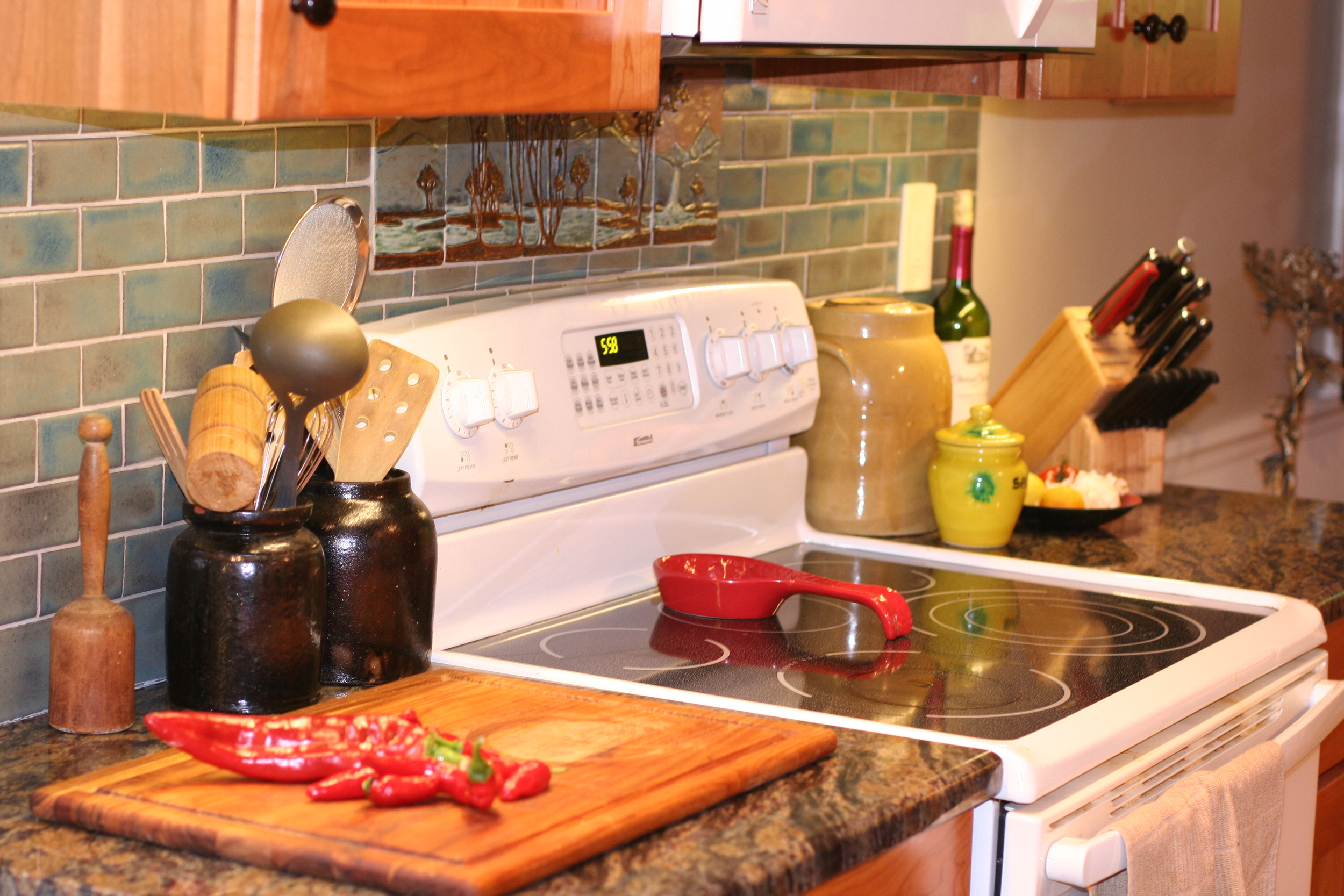
Handmade ceramic subway tiles from Clay Squared to Infinity (Minneapolis, MN) were chosen for the backsplash. The rustic tiles come in lots of homey colors. I chose the variable blueish North Shore glaze, which looked a lot lighter in sample than what was finally delivered. Still, the end result looks pretty, though a bit darker than anticipated. To match the backsplash, I chose a pretty suite of decorative tiles in a mountain motif from Ravenstone Tiles (Port Townsend, WA) to set above the stove.
Ravenstone landscape tiles
Flooring was the hardest to choose. Our designer logically suggested easy-clean, no-break laminate options while I wanted something stone, Craftsmanesque, totally indestructible for my destructive family, and harder to install. After ordering loads of tile samples and visiting flooring store after flooring store, I fixed on 12"x 12" tiles of Brazilian blue slate. These were then hand cut and set into a groovy hopscotch pattern by our designer and a matte seal was applied to maintain the natural look of the slate. The end result is beautifully tough. I love the cool, natural feel of the stone on my bare feet in summer. (In cold weather I'll wear slippers.) It shreds sponge mops, but it's a downside I can live with.
There were lots of other bits and pieces to pull together. For cabinet hardware, I chose super cool oiled bronze knobs and handles from Craftsman Hardware. The surprise is that their solid, true-to-period hardware is higher quality and less money than the cheesy stuff offered by Kraftmaid. Hanging pendant lamps for the island came from Cal Lighting, though one came damaged, and we are still waiting for a replacement.
Bronze, oil-rubbed, pyramid handle by Craftsman Hardware
By the time demolition started, nearly all the pieces were in place. It took around three and a half weeks to complete--very efficient and pain-free. During the final two weeks of work we were on vacation and returned to a lovely new space. A few odds and ends still need to be completed, but that is to be expected.
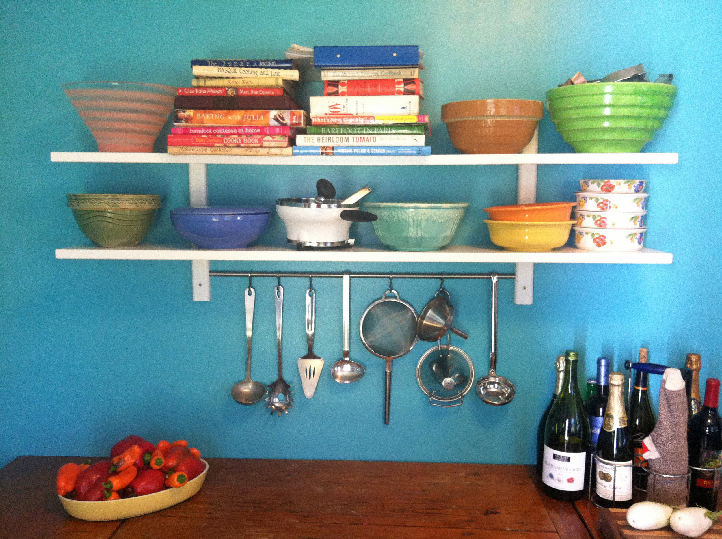
In the end, the room was finished off with paint, I bought some red-enameled island stools, and so on. For paint, our designer chose Analytical Gray, a neutral, taupish, Sherwin Williams offering. Additionally, I painted the adjoining pantry room a bright teal (Caruso by Olympia) to contrast with my collection of candy-colored antique mixing bowls. The flashy teal also creates a background pop of color to set off the more subdued hues of the new kitchen.
We're glad to have a nearly complete beautiful new kitchen. Now on to our corroding, cracking, aged bathrooms.
